BrandVerity
Improving Website Accessibility for Digital Marketers
Date: February-December 2018 | Duration: 10 months | Role: Project Manager, Designer, Developer | Team Size: 4 | Software: Sketch App, Illustrator, Photoshop, After Effects, InVision, BrowserStack | Skills: Illustration, Animation, HTML/CSS, HubSpot HubL, JavaScript, Project Management
Company Overview
BrandVerity offers a technology that crawls the web and finds non-compliant ads on search engines, outdated promotions, or missing disclosures. With the tool, clients can actively take down harmful advertisements or legal risks that could damage their brand.
The Challenge
Following an investment in customer and market research, the marketing website needed to reflect new product messaging and address accessibility issues. In addition to the site maintenance, we planned to expand our site structure to offer more content for deeper educational user journeys.
Personas
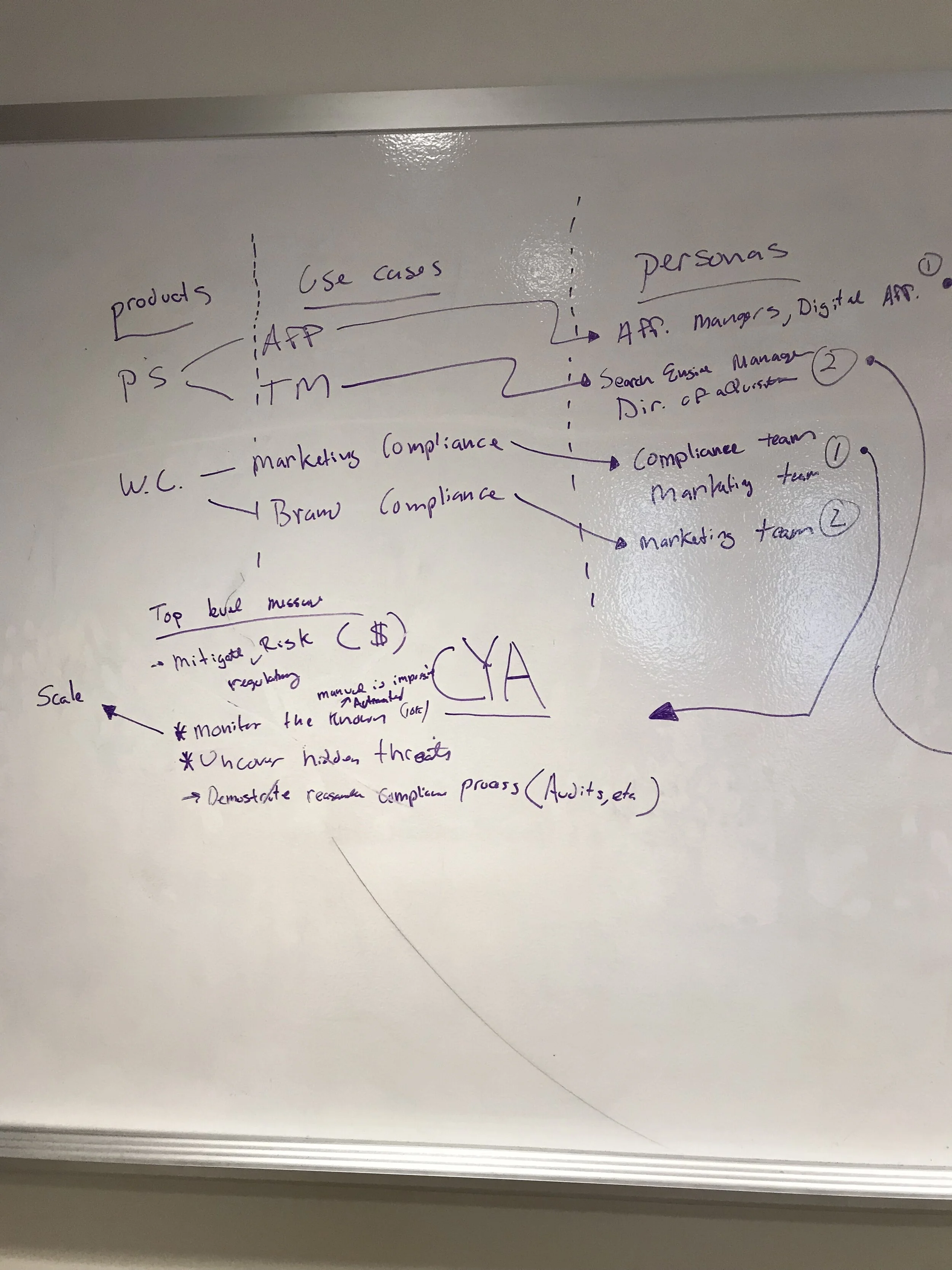
In lieu of speaking with users directly, we leveraged the conversations our Customer Success and Product teams were having with customers to ensure we understood the range of our core users' needs in the evolving digital marketing space.
Product: Paid Search Monitoring
Our most popular offering is used by digital marketers running affiliate programs, and/or with strong brand recognition that is targeted in paid search advertisements to siphon web traffic. They are looking to increase branded conversions, vet their affiliates, and minimize advertisement costs.
Their titles may be Affiliate Managers, Digital Affiliate Manager, Search Engine Manager, Director of Acquisition.
Product: Web Compliance
Our more complex offering can be customized for a variety of uses and is often a part of compliance processes in highly regulated industries. Credit card issuers, credit card publishers, pharmaceutical companies, and CBD advertisers can all be found liable for inaccurate information online and need help gathering data in real-time. They are looking to ensure online compliance, view their branded digital landscape, and remediate issues quickly.
The users are Compliance Teams or Marketing Teams.
Wireframes & Prototypes
Review UX Improvements
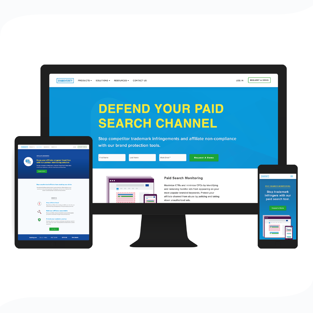
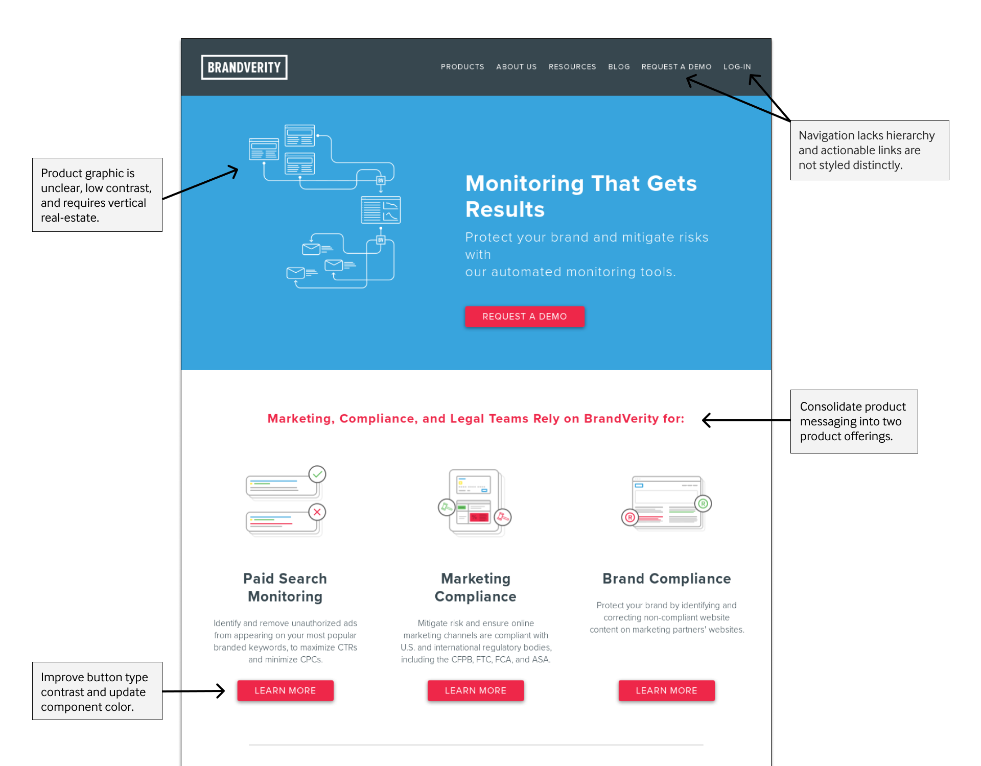
After distilling the motivations and problems our target audiences experience, we started to assess the structure of our website and triage the changes needed to better explain the products and how BrandVerity can help. This included a visual hierarchy in the navigation, reworking product illustrations, creating a responsive design, and reworking color contrast for buttons and typography.
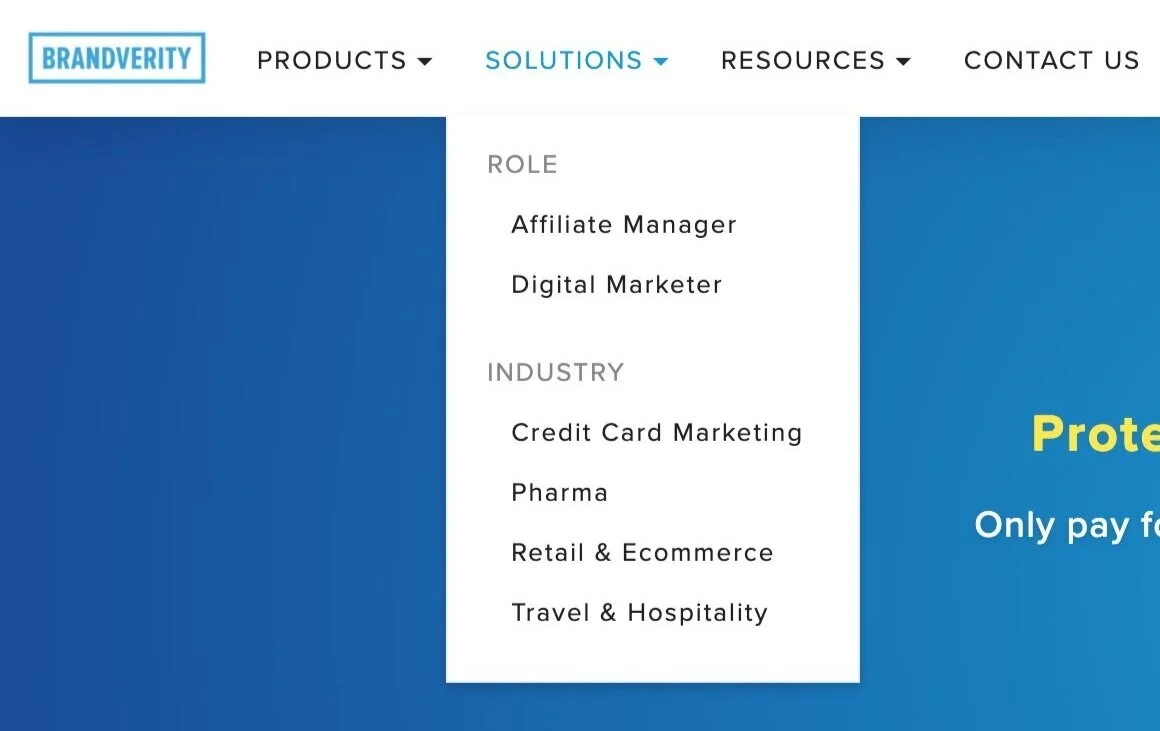
Expanded Sitemap
Moving the “About Us” and consolidating resources allowed us to simplify the navigation and include product use-cases. This scoped the project to updating two webpages and creating five new pages.
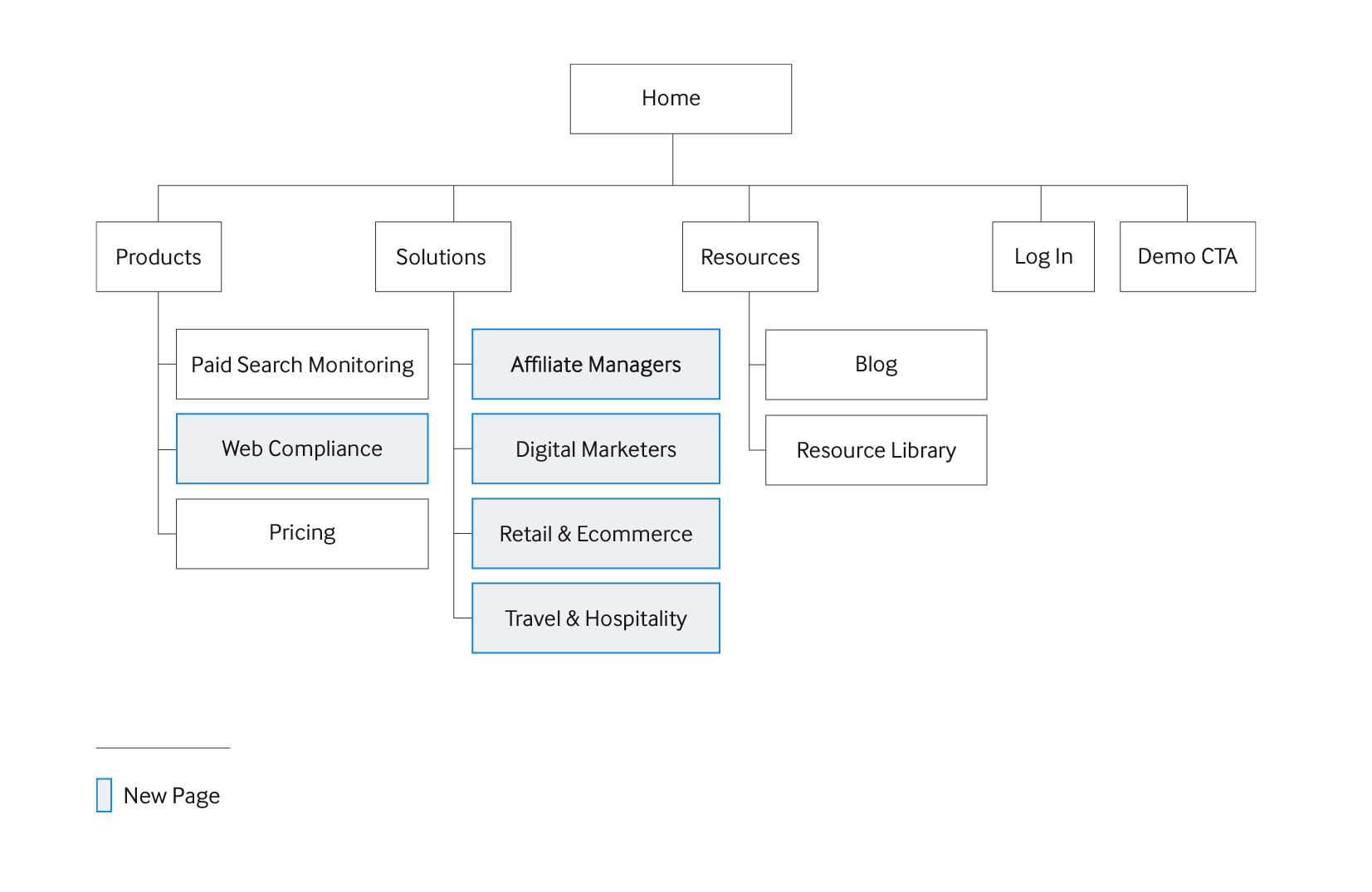
With two product offerings and a variety of use-cases, the hierarchy of the website caters to our most valuable customers first while providing entry points for more complex enterprise customers to discover offerings available for their business on various "solutions” pages. The homepage layout resembles a marketing funnel that would appeal to a broad audience first with more tailored messaging further down the page.
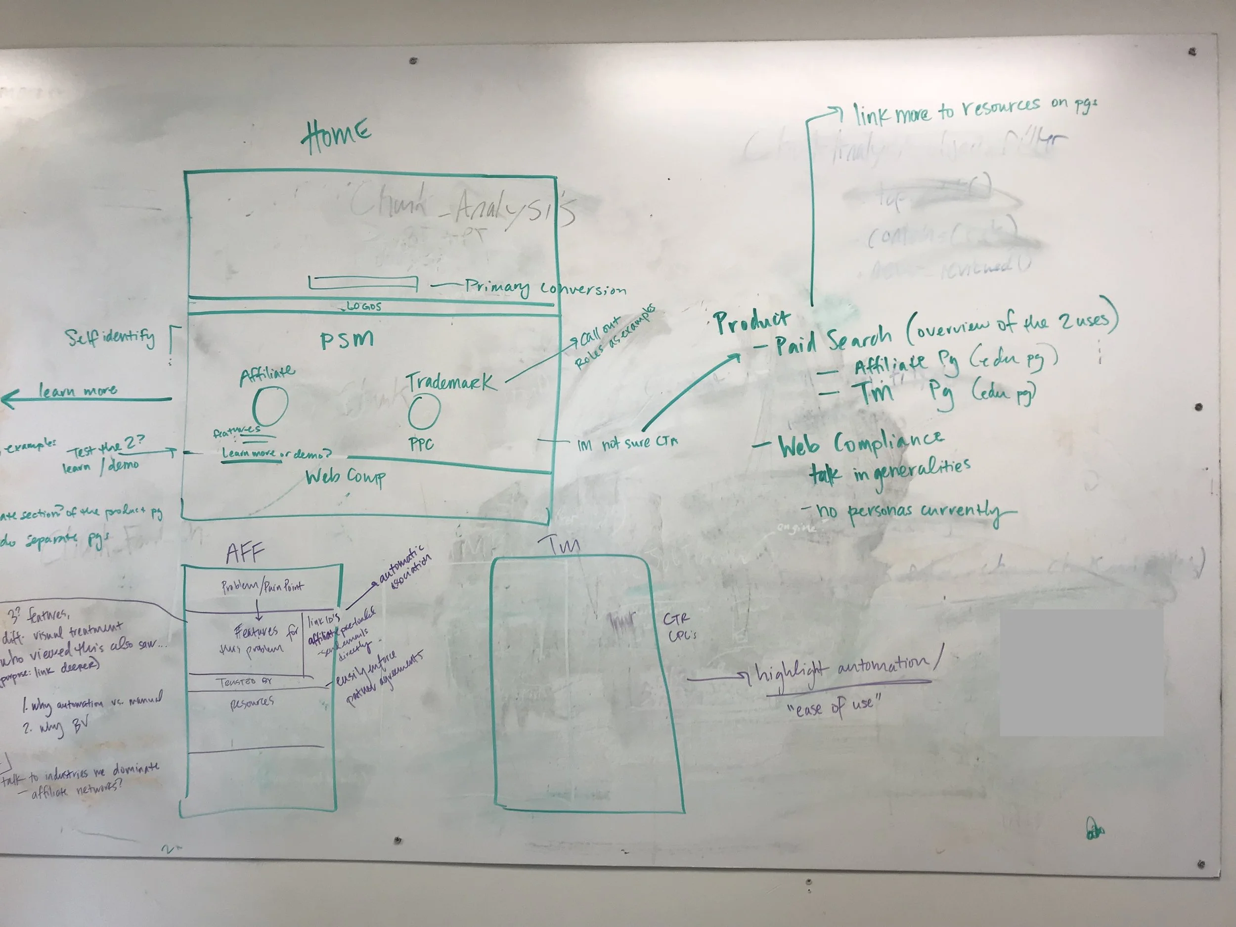
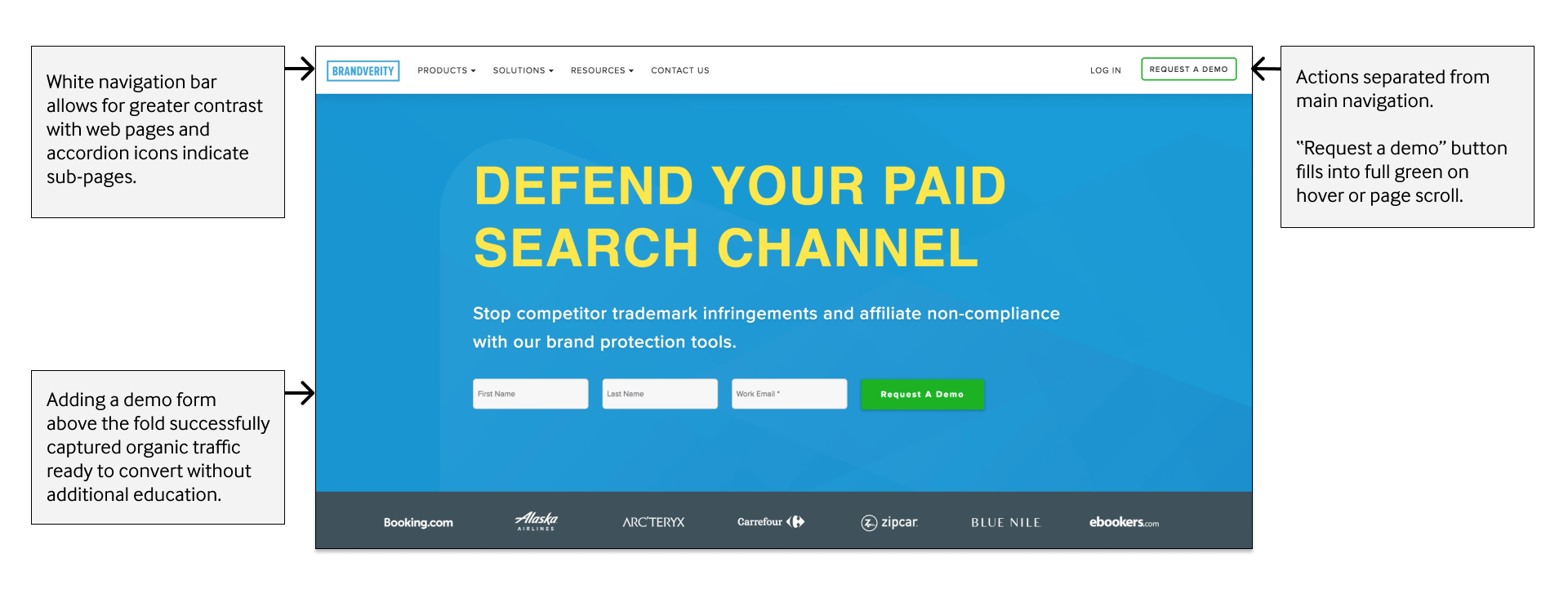
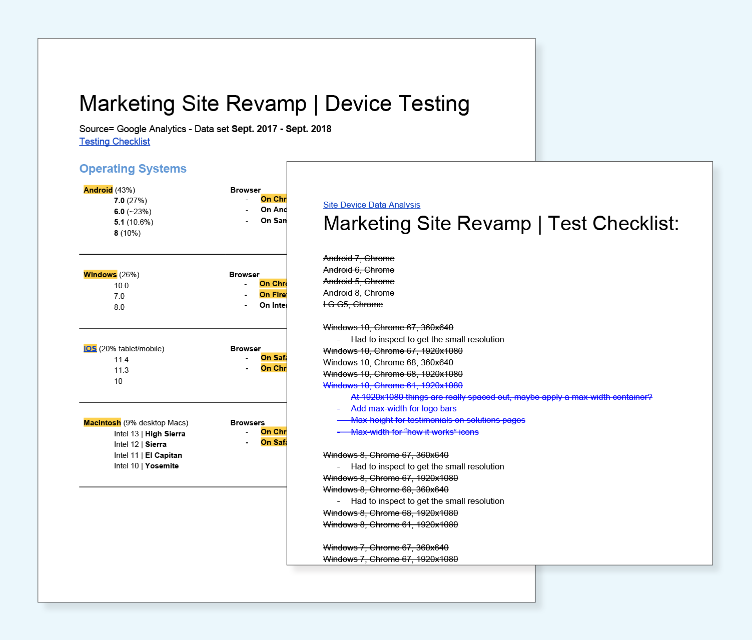
We reviewed heatmaps of users on various pages and I pulled device data from Google Analytics to understand the share of desktop and mobile traffic. By developing wireframes and filling in copy as it was written, the team was able to iterate on the functionality and user-flow in tandem. For instance, adding a demo request form above the fold on the homepage allowed for quicker conversions and altered the messaging for that section.
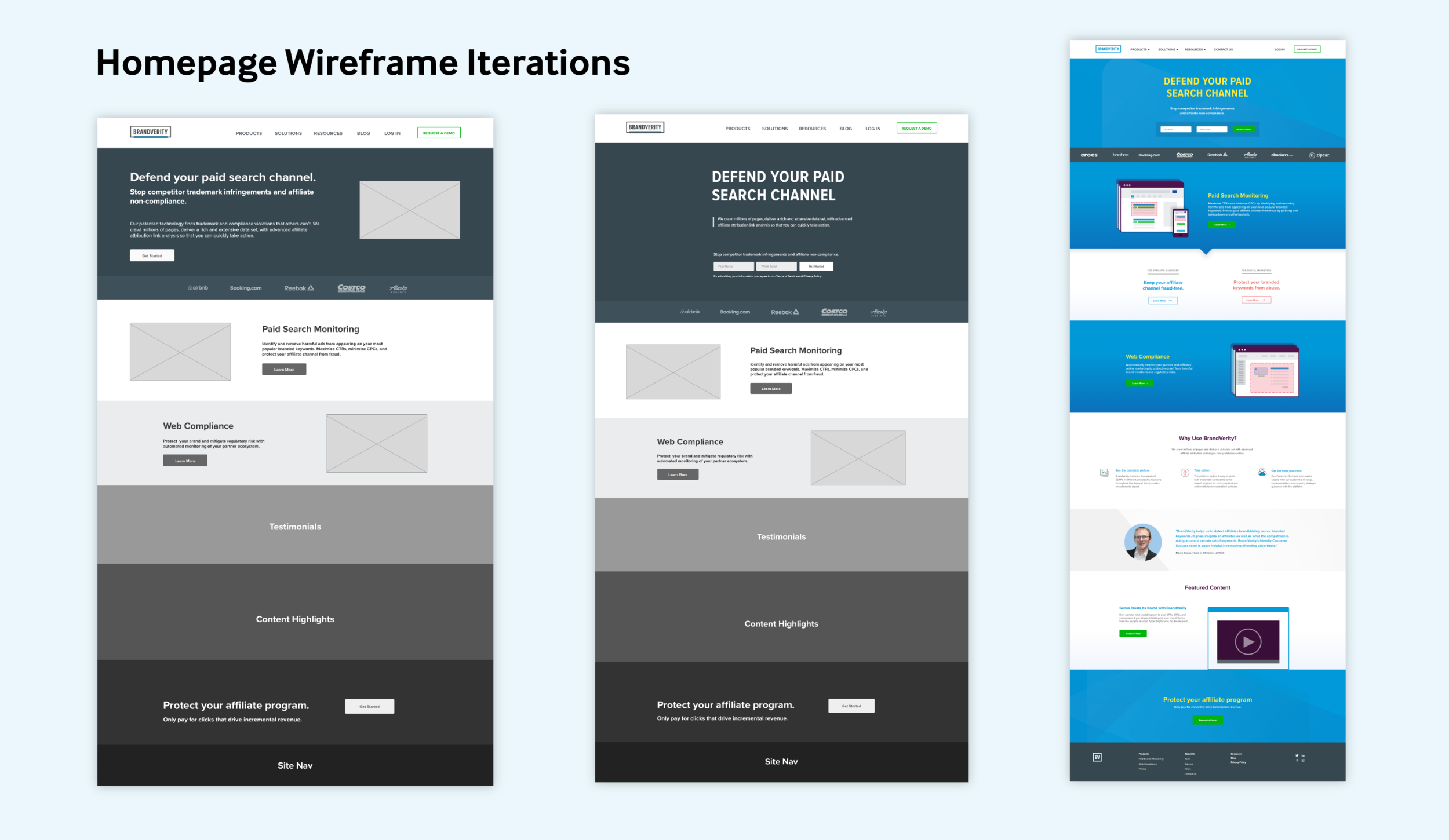
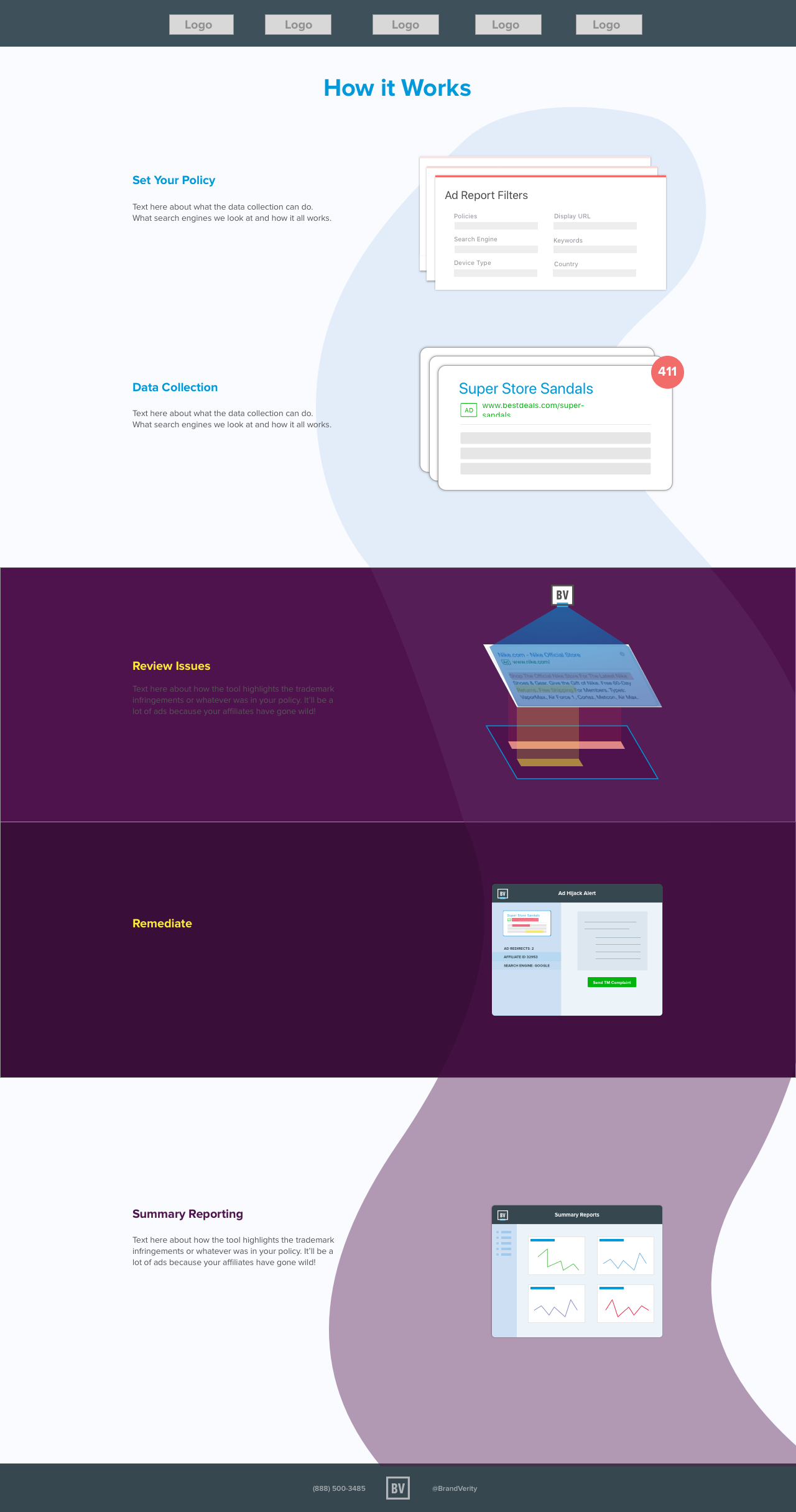
Final Homepage Design with UX Improvements
Product Illustrations
When potential clients reach out knowing they have a problem, there is still a learning curve to understanding how the technology works. We wanted to introduce a “How it Works” section for each product page to provide a visual story.
I consulted the product and sales team to understand important elements of the technology’s backend and which elements spoke strongly to digital marketers.
I researched and incorporated design patterns used by search engines to abstract ad representations. I then created iterations of illustrations that allowed for static and animated visuals of the BrandVerity software scanning, detecting ad violations, and highlighting issues.
Below are visual explorations.
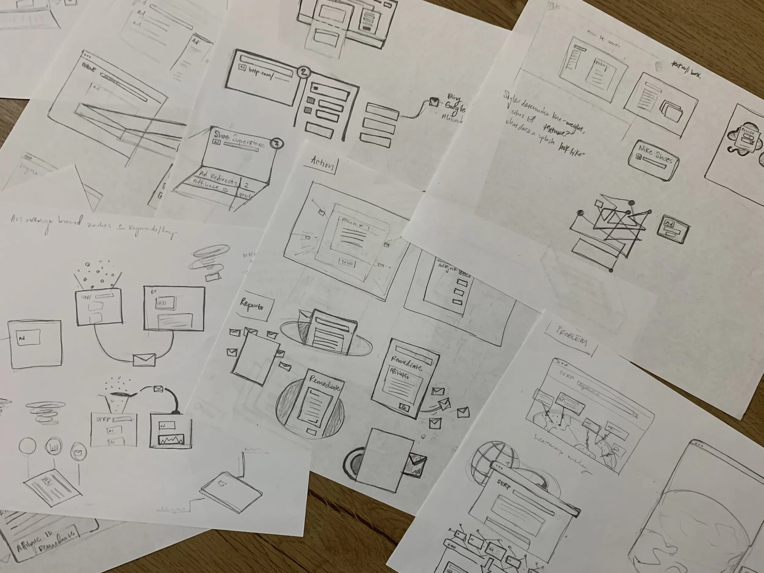
“How it Works” Visual Explorations
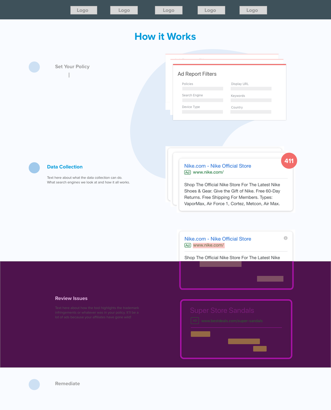
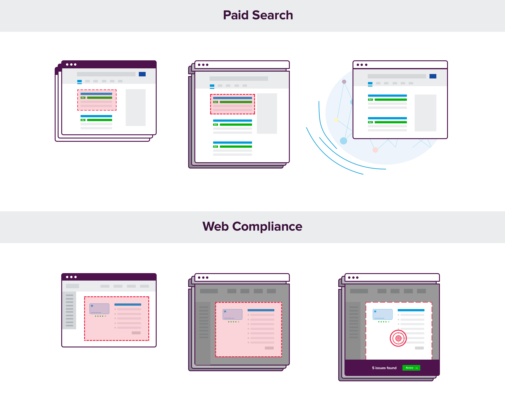
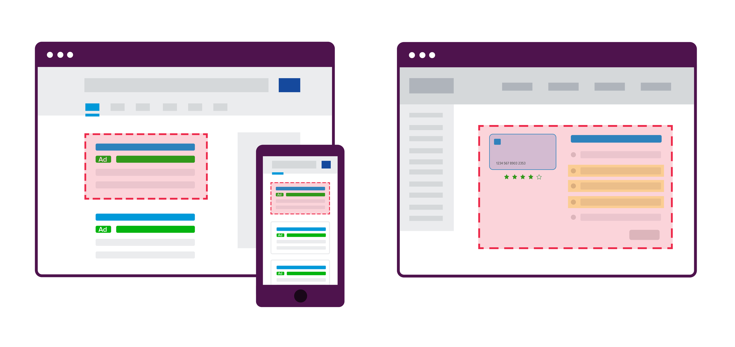
In the “How it Works” iterations, we discussed layouts that would span an entire page, possible animations to the webpage, card layouts, and introductions of new visual styles. After some scope-creep and concerns around representing the product interface, I created a stand-alone visual that could be animated, and added to sales decks or marketing collateral.
The Final Product Animations

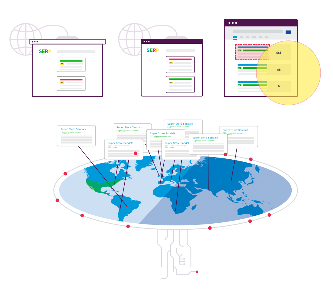
Paid Search Monitoring product animation showing trademark infringement detection.
Web Compliance Product animation showing discovery, on-page highlighting, and alerts.
Development
A large part of reworking the marketing site was the opportunity to build responsive pages. Using HubSpot as our CMS, I built the webpages using HTML, CSS, HubL, Flexbox, and Javascript. The page code had to enable text and image editing features for the CMS page editor level (used by all members of the marketing team). I tested frequently to ensure the correct code modules were used for both flexible and rigid page-editing abilities.
Our team grew to include an SEO expert on the team. With their perspective and research, we built out solution pages for more keyword targeting and a deeper conversion funnel. This also highlighted the need to ensure the HTML layout would index appropriately and maximize screen-reader functionality.
Page testing and code refactoring
As the pages were built, I ran them through BrowserStack to ensure the quality was consistent across devices types and browsers. I analyzed the site traffic in Google Analytics to determine which devices and browsers to prioritize and which to ignore. Additional support was scoped after the launch to refactor legacy code and improve page loading times.
Technical challenges
HubSpot presented a large learning curve as I went in deeper to understand how to translate the designs into functioning webpages. There were layers to the codebase: 1) HubSpot defaults and 2) previous customizations using the BEM model in an inconsistent way.
Specific challenges:
Horizontal forms required extensive customization and testing as it was not an innate ability (2 years later this became a feature in HubSpot).
HubSpot navigation bars could only go 2 levels deep but the design required headers to indicate the solution type. With the help of an engineer, we were able to alter the javascript to remain open when hovered and I styled the child elements with CSS.
The product animations also required custom javascript that would enable it to play each time it came within the browser view instead of running the first time the page was open.
HubSpot honors CSS that is changed from the editable template. This means I needed to build in features that would either block edits (text colors, header styles) where appropriate, and enable editable modules where flexibility was more important (body text that may have a variety of emphasis).
Final Website Experience
The Homepage
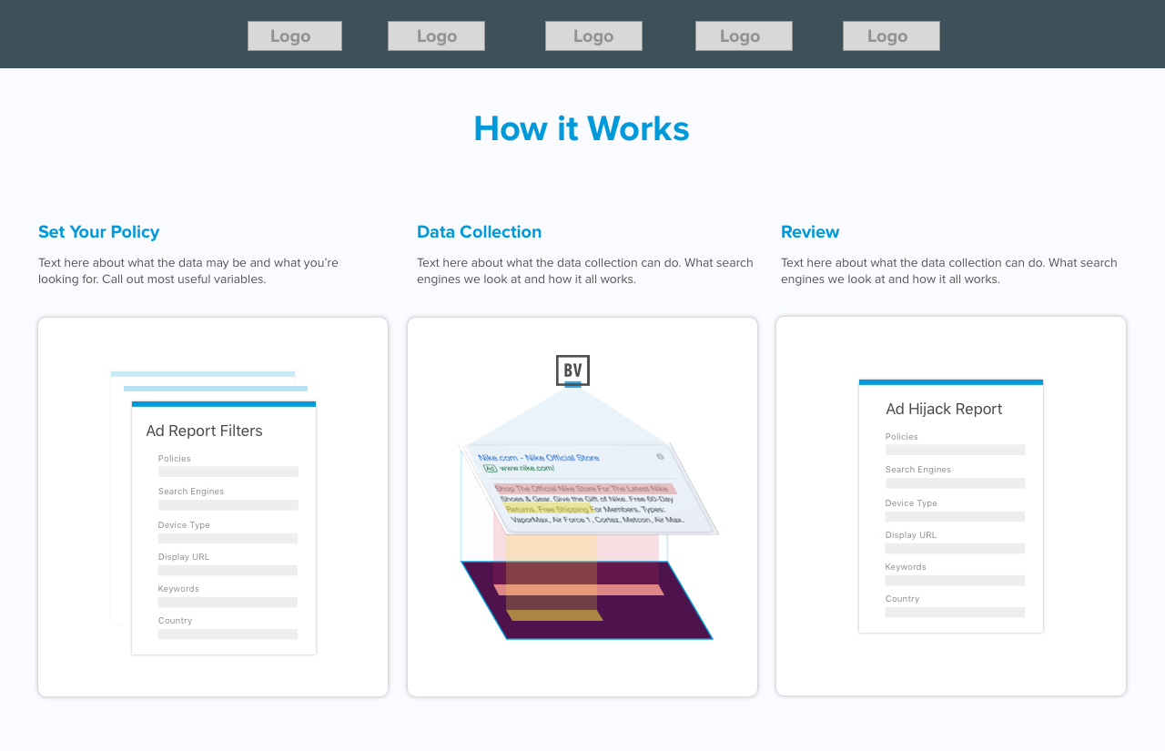
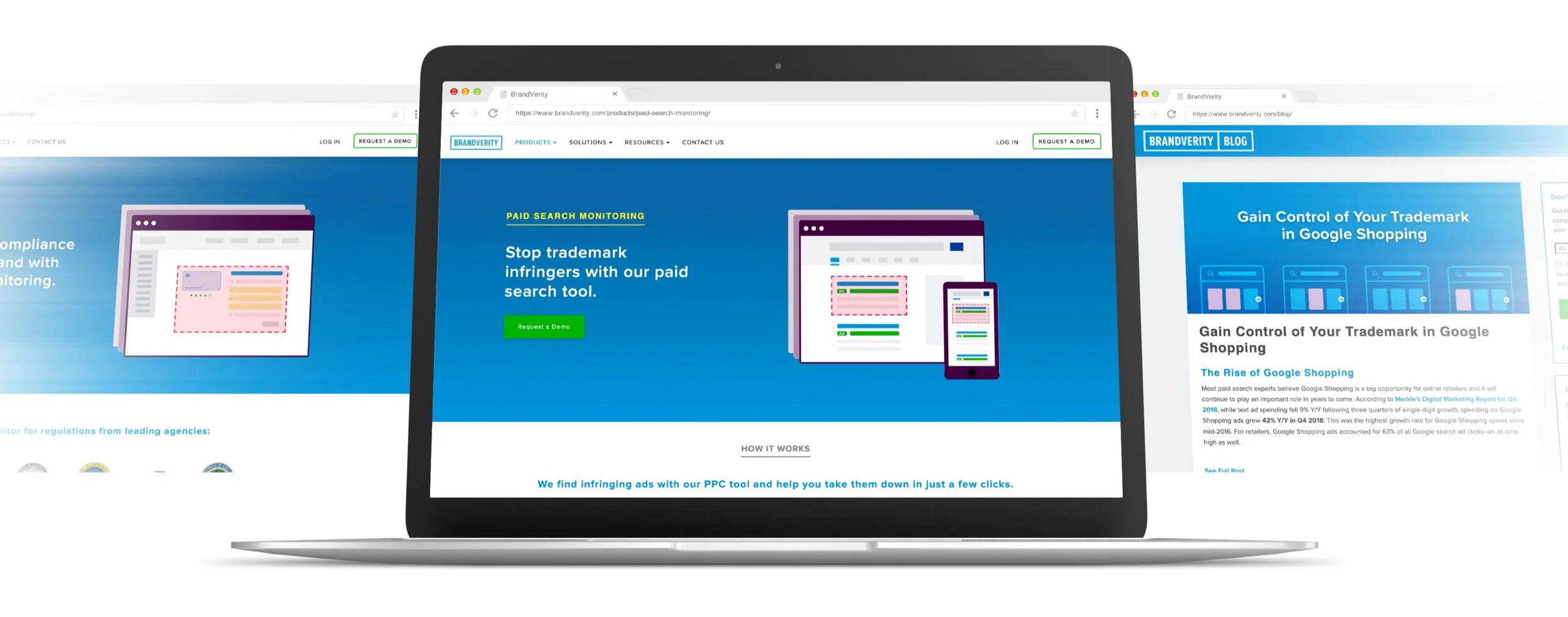
The Paid Search Monitoring product page
Takeaways
This project had a variety of stakeholders and many pauses in production as priorities shifted. I found scoping to be very challenging when learning how the HubSpot codebase would function and in the future would structure time to solve development specific issues proactively.
As I have grown in web development, I would like to introduce color-contrast tools in the design process to insure color interactions are optimized for readability.
Creating templates enabled the marketing team to respond quickly to growing demand for messaging in different verticals. This allowed the team to support conference collateral and sales initiatives in a more robust way. With a wealth of whitepapers and webinars, we were able to promote content across the site and target prospects who were researching a specific topic.
Investment in SEO and optimizing loading times improved our search rankings and domain authority.
Our lead nurturing campaigns could be triggered by industry-specific form fills and we had more opportunity to drive traffic with targeted ad campaigns on Linkedin and sponsored content.