BrandVerity
Branded User Journeys
Date: Nov-Dec. 2017 | Duration: 2 months | Role: Visual designer, Developer | Team Size: 4 | Software: Sketch, InVision | Skills: UI design, Wireframes, Prototyping, HTML/CSS, HubL
Company Overview
BrandVerity offers a technology that crawls the web and finds non-compliant ads on search engines, outdated promotions, or missing disclosures. With the tool, clients can actively take down harmful advertisements or legal risks that could damage their brand.
The Challenge
The marketing team at BrandVerity began producing a lot of new and engaging gated content but the user experience downloading each piece had dated branding and wasn't mobile responsive. To elevate the experience, we set out to rebrand the user journey.
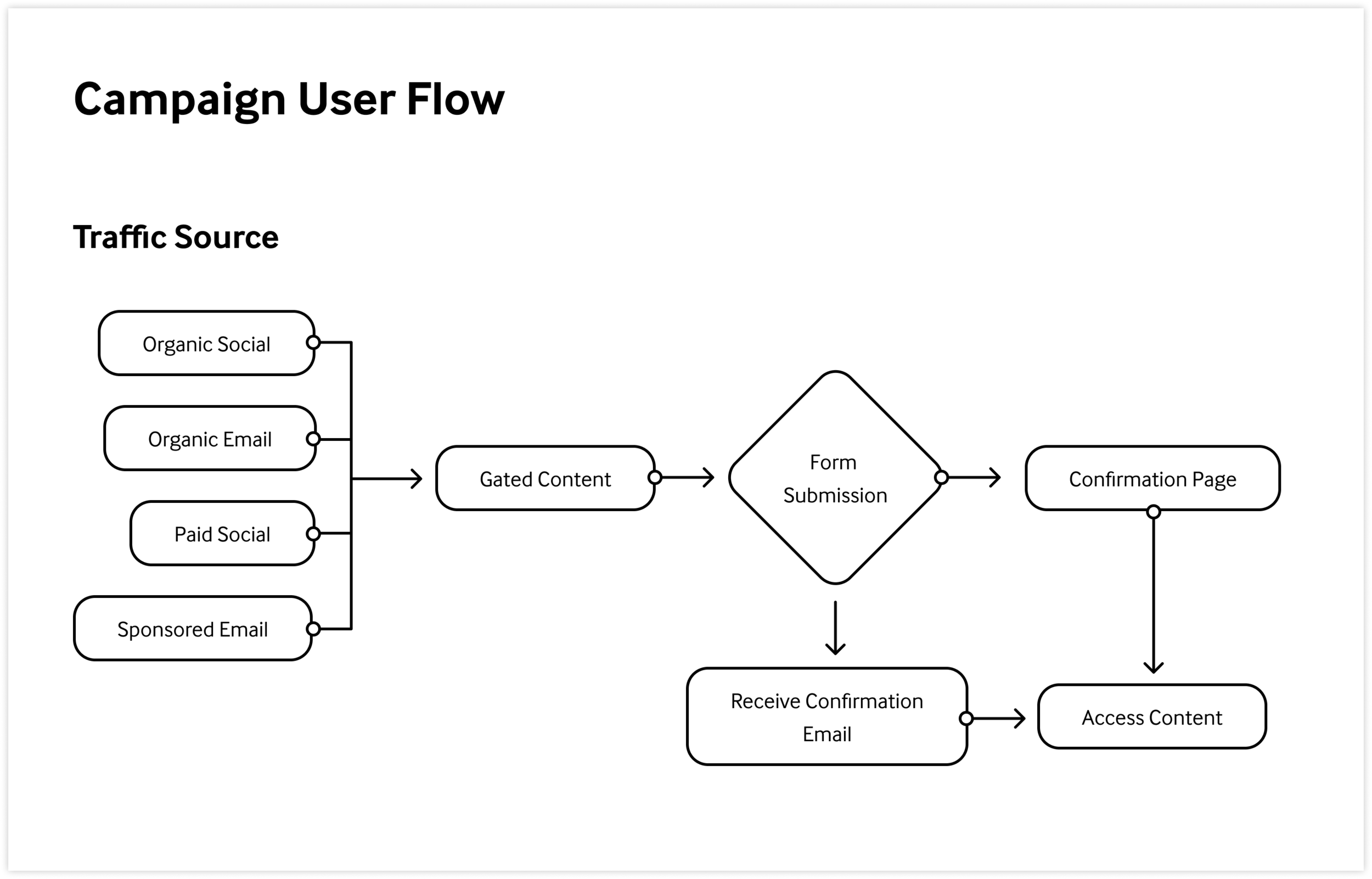
Campaign User Flows
There are several entry points to a content campaign that drive awareness to a new offering. However a user arrives to the gated content, we wanted to ensure they felt a cohesive journey with the same branding visuals and messaging. Below is a standard user flow that outlined which pieces we needed to review.
Landing Page Audit
Review UX Improvements
In scoping the new templates needed, we reviewed existing landing page layouts to understand where we could improve the user experience and the editing experience in HubSpot for accelerated production.
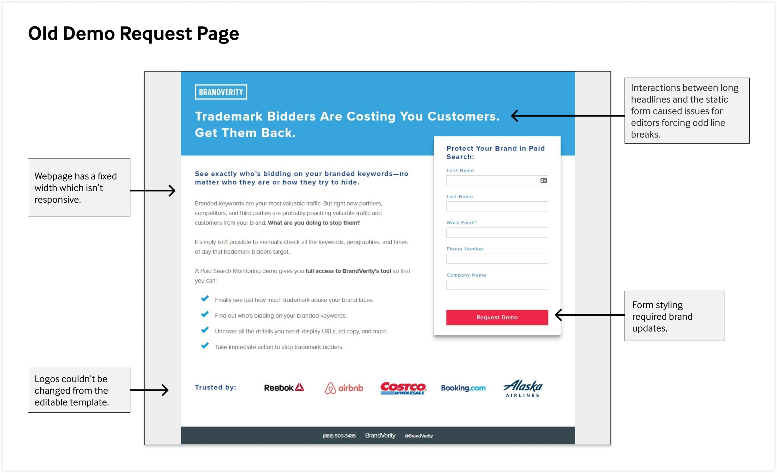
This image points out that the webpage has a fixed width and isn’t responsive, the form components need brand updates, logos couldn’t be changed from the editable template, and interactions between the headline and the form would cause odd line breaks.
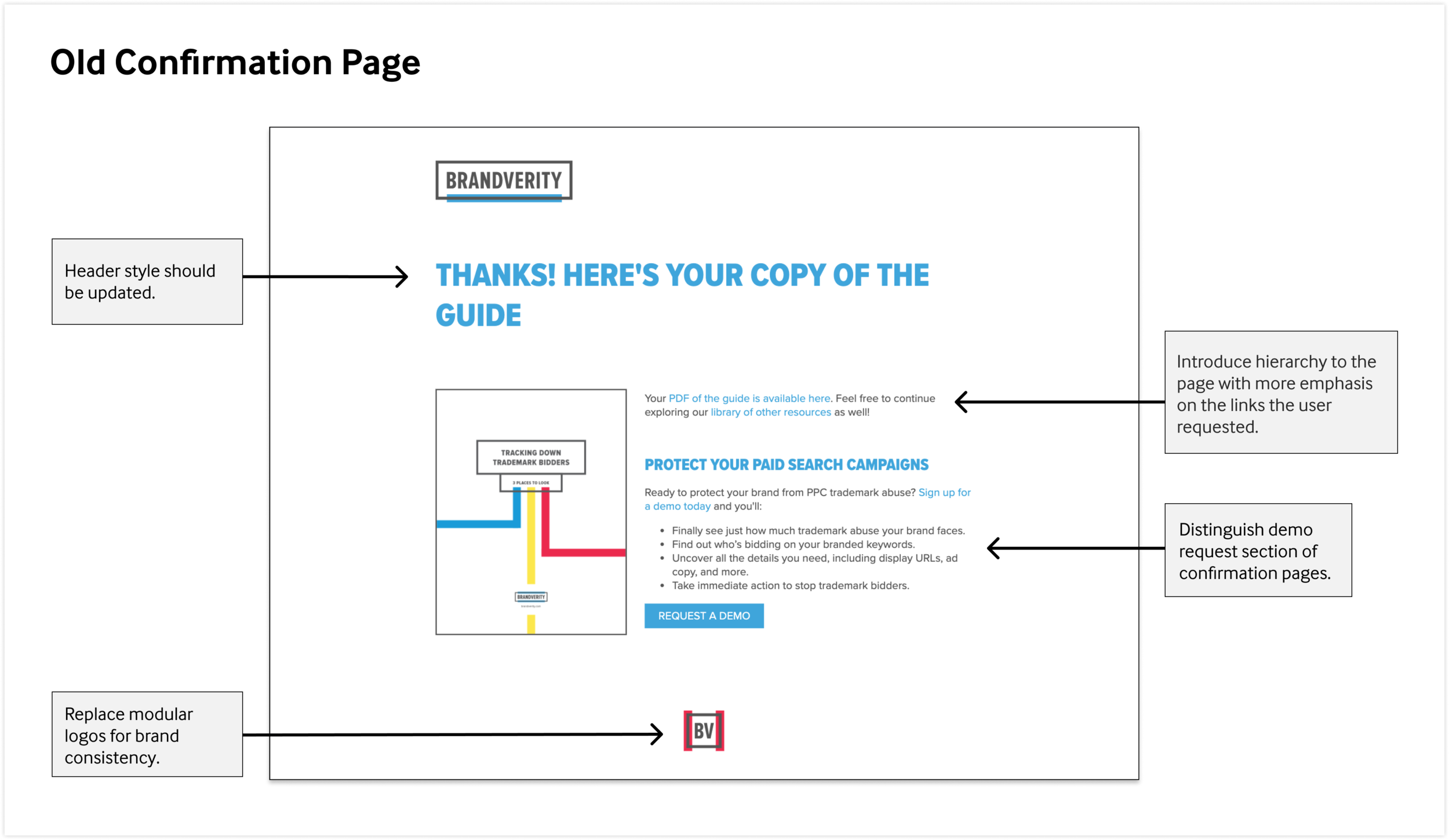
This image points out that the old confirmation page had a lack of hierarchy, multiple styles of the brand logo, and outdated header styles.
Scope
The team required five new templates:
Demo Request - Paid Search Monitoring
Unique Attributes:
Testimonial block
Client logos
Demo Request - Web Compliance
Unique Attributes:
Regulator logos
Ebook Downloads
Unique Attributes:
Cover Image
Inside preview
Webinar Registrations
Unique Attributes:
Highlight the speakers
Prominent display of the day/time of the event
Confirmation Pages
Design Explorations
With content outlines clarified, I worked to define a visual style that would apply new secondary colors being introduced to the branding. Below are visual explorations that expanded upon wireframes using existing content to gauge the layout functionality.
The demo request pages didn’t require many visuals and so I took the opportunity to explore form styles. Unfortunately I was not aware of the rigid coding abilities for HubSpot forms at the time.
While evolving the brand’s secondary colors, I experimented with different gradients and background styles that would create section blocks for quick eye scanning. Some landing pages launched with the purple style, but was eventually phased out to adhere to the BrandVerity blue.
The webinar templates were more challenging to design for as the content length could vary. We discussed including short bios for the speakers or adding testimonials to the pages. I also experimented with different form styles to keep the form above the fold as a test for conversion rates.
From Design to Production
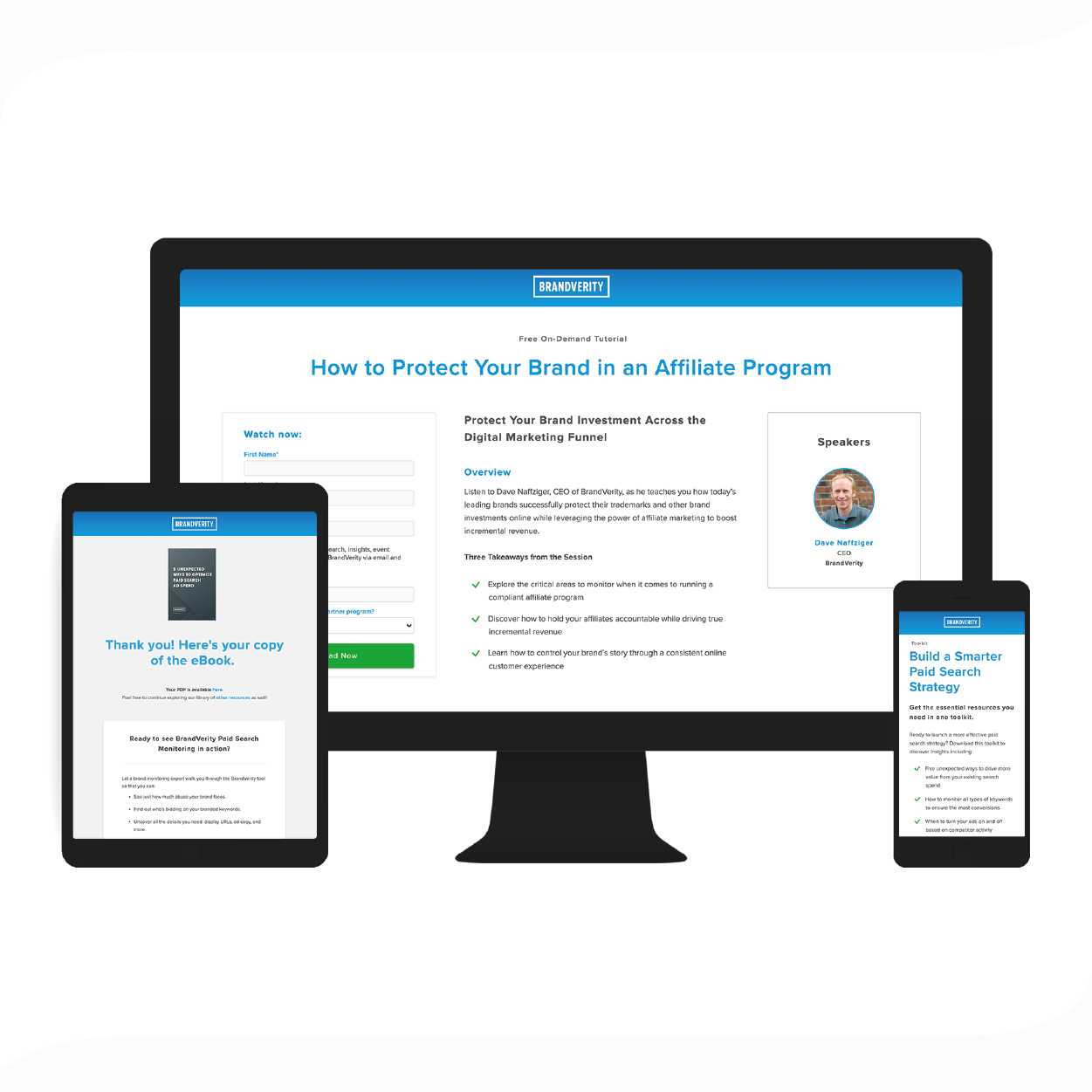
As I began to better understand the intricacies of HubSpot and the variations of landing pages, I presented the team with prototypes along the way to assess the content structure and brand cohesion. The following are screenshots from live webpages and serve as the templates used today.
The webinar templates required a custom module that enabled an editor to select how many speakers to represent on the page. I coded a module for the speaker photo and information to repeat as many times as the loop was selected. The team was super pleased to have such flexibility and I was proud to enable it!
A variation of the confirmation page on the left was in production as the new standard template. Over the next couple months we received feedback from the sales team that some users would mistakenly request a demo while trying to access content from the confirmation page. We reviewed the confirmation page for confusing copy but ultimately decided to visually distinguish the two sections. We were of course pleased afterwards when users intentionally requested a demo after reading our content!
Technical Challenges
This was my first development project at BrandVerity and I found the learning curve in HubSpot to be challenging. Updating over 30 landing pages to a new template presented an opportunity to erase valuable copy.
Things I learned:
To transfer text when swapping templates, the modules must have the same name in the backend. Otherwise, text will be scrambled or erased.
Some text modules are preferable if you don’t want the editor to change the style (e.g. headers), other text modules allow the editor an ability to emphasis text at their discretion.
If you edit a landing page at 50% width on your computer, the style will not transfer when full-width.
HubSpot forms are very rigid in their responsive design. It was not possible to place two inputs in-line with each other. It became available as an option years later as a drag & drop feature.
Once the templates were optimal and tested for editing capabilities, I ran the pages through BrowserStack to check the code rendering across various device types and browsers.
Business Impact
After launching new pages, I would review recordings in HotJar of users going through the flow. I noticed several users hit the confirmation page and exit out of the webpage without clicking through the various content links. I also became more familiar and involved with our demand generation workflows and suggested we trigger a confirmation email to send the user a permalink to the content and reiterate our brand messaging. These emails performed extremely well with an average CTR of 39.63% and even lead to a number of fruitful product demos.
Overall, we saw a 28% increase in form submissions across the site. With the brand refresh and new mobile responsiveness, the team was able to generate multi-prong campaigns quickly with less friction in HubSpot.